Consulting

Results 1 to 5 of 5

Thread: Chart Help::Stacked Column

  1. #1

    Chart Help::Stacked Column

    Does anyone know how to do the following?

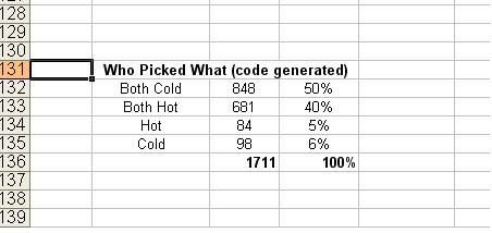
    I have the following percentages


    So there are 4 sub-categories (percentages) EACH of which fall into 2 main categories.

    Correct
    Both Cold = 50%
    Both Hot = 40%

    Incorrect
    Hot = 5%
    Cold = 6%


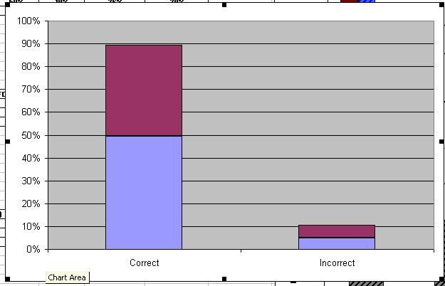
    Now I have produced the following stacked column graph to show which
    of the 4 subcategories fall into each of the 2 main categories


    The problem is that I want to assign a color and series label to EACH of the 4 subcategories.

    So under "Correct" from 0 - 50% will be one color and from 50 - 90 % will be another.

    Then under "Incorrect" 0 - 5% will be yet another color and 5- 10% another.


    I have tried so many different combos of source data that I can't even remember which I have already tried.

    Any ides?

    Thanks!
    Last edited by Saladsamurai; 10-08-2009 at 06:26 AM.

  2. #2
    Anyone have any suggestions on this one? I tried putting the 50% and 60% ("Correct") in one column and 5% and 6% ("Incorrect") in another, but I still can't get it right?

    I can't figure out what order to select the data so that it will format the way I want it.

  3. #3
    Distinguished Lord of VBAX VBAX Grand Master Bob Phillips's Avatar
    Joined
    Apr 2005
    Posts
    25,453
    Location
    You can select an individual data point and set its fill colour independently.
    ____________________________________________
    Nihil simul inventum est et perfectum

    Abusus non tollit usum

    Last night I dreamed of a small consolation enjoyed only by the blind: Nobody knows the trouble I've not seen!
    James Thurber

  4. #4
    Quote Originally Posted by xld
    You can select an individual data point and set its fill colour independently.
    I don't know... with the above plot, since both red potions are from the same series, when I right-click one of them and change the color, they BOTH change.

    Still trying though.

    Thanks!

  5. #5
    MS Excel MVP VBAX Mentor Andy Pope's Avatar
    Joined
    May 2004
    Location
    Essex, England
    Posts
    344
    Location

    Thumbs up

    Lay your data out like this. In 3 columns over 5 rows.

    <empty> Correct Incorrect
    Both Cold 50% <empty>
    Both Hot 40% <empty>
    Hot <empty> 5%
    Cold <empty> 6%

    Create a stacked column plotted by rows.
    Cheers
    Andy

Posting Permissions

  • You may not post new threads
  • You may not post replies
  • You may not post attachments
  • You may not edit your posts
  •